In the Chatbots tab, you can switch the toggle from Chatbots to Themes. There, you can modify the default themes that come with AI Engine using a no-code editor.
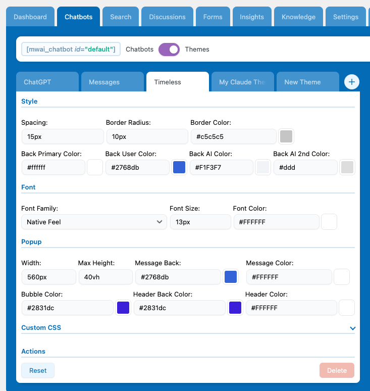
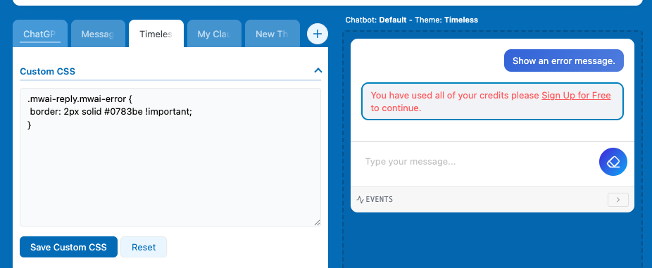
You can customize pretty much everything for the default themes (Timeless, Messages, ChatGPT) using the visual editor. But if you want to change something specific in an existing theme, you can use the Custom CSS section to adjust just that part instead of writing your whole theme from scratch.
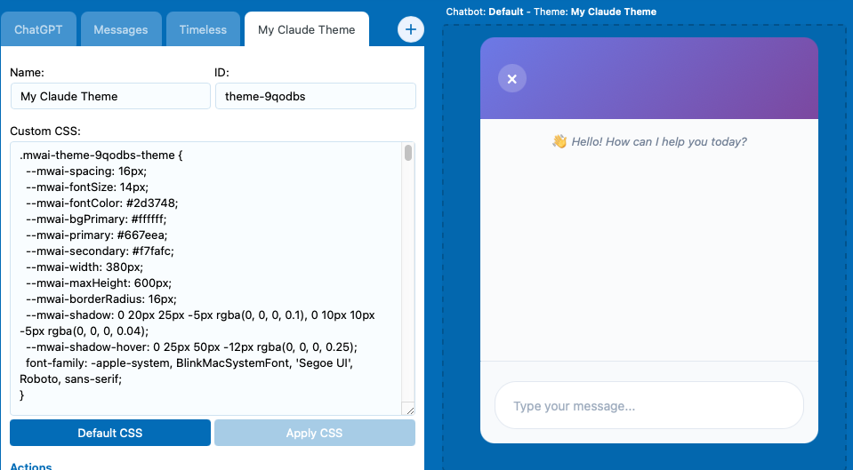
If you want more customization, you can create your own theme by clicking the + button. This will open a CSS editor where you can manually use AI Engine’s chatbot class definitions to build your own custom design.
If you have some CSS ready to load, you can also use the following filter to change the CSS of your theme on the server side:
add_filter( 'mwai_chatbot_style', 'my_chatbot_style', 10, 2 );

function my_chatbot_style( $style, $chatbotId ) {
  return $style . "
    <style>
      #mwai-chat-$chatbotId {
        background: #343541;
        color: white;
        font-size: 15px;
      }
    </style>
  ";
}
These themes can also be used in the AI Forms.
Icons & Avatars
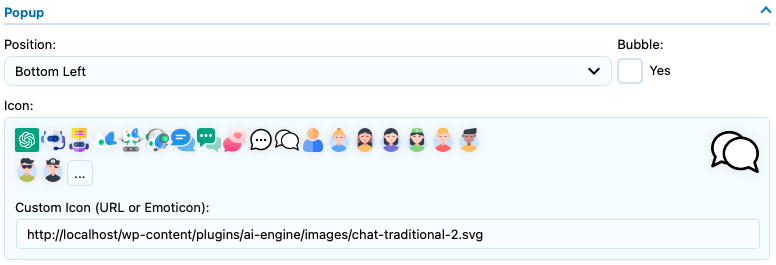
The icon refers to the chatbot pop-up image, which is only visible when your chatbot is configured as a pop-up—either because you’ve enabled that setting or are using the Site Wide Chatbot. The avatar, on the other hand, refers to the image displayed inside the chat itself, serving as the “profile image” of the chatbot and the user.
Settings
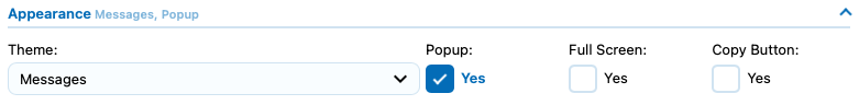
Make sure to enable the “Pop-up” option under the Appearance section to make the pop-up settings appear. In there, you’ll be able to choose an icon or enter a custom URL directly.
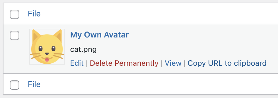
To change the avatar, simply check the “Avatar” boxes in the Appearance section and upload or select the desired images.
Shortcode
Using the shortcode of the chatbot, you can specify the icon param, with the URL of your icon, like this:
[mwai_chat icon="https://mywebsite.com/icon.png"]To set the Avatar you can replace the name of the Chatbot by using a link instead of a regular text.
[mwai_chat ai_name="https://mywebsite.com/ai-avatar.png"]
[mwai_chat ai_name="https://mywebsite.com/ai-avatar.png" user_name="https://mywebsite.com/user-avatar.png"]
You can get the URL directly from your Media Library by clicking the “Copy URL to clipboard”.
If you keep the user_name empty and an user is connected, it will retrieve the gravatar or the avatar already set in WordPress for this user. Remember that by default, user_name is not empty and set to “User :”.
Displayed Texts
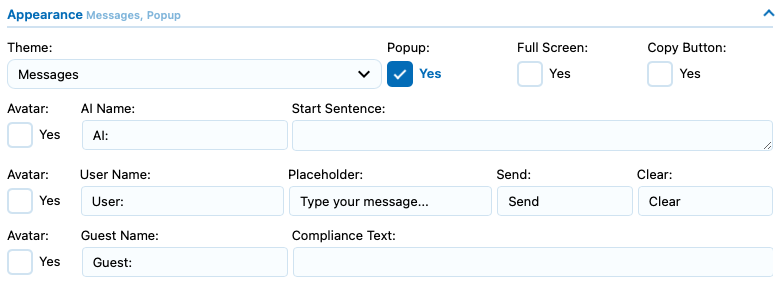
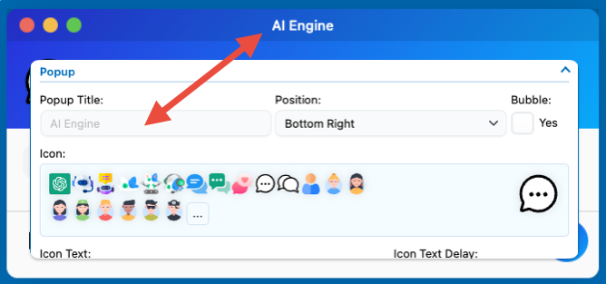
The chatbot displays various text elements inside and around the chat interface: the AI name, the user name, a name for guest users, a compliance text shown below the chatbot, an Icon text above the chatbot when it’s in pop-up mode and a Start Sentence to have a first message in the chat. You can customize all of these values individually in the chatbot settings under the Appearance section.
Settings
Simply change these values in the Appearance settings and check the preview on the right side to see how your modifications look. The Send and Clear settings correspond to the text inside the respective buttons. Depending on your selected theme, this text might not be visible—for example, the Timeless theme uses icons instead of button text.
There are a few placeholders available for you to use in your ai_name parameter. Generally, you would want to use {DISPLAY_NAME}, which is what the user would expect to see.
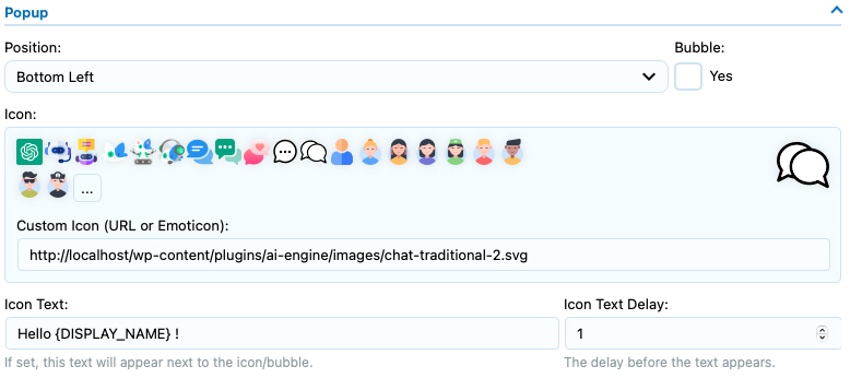
If you want to change the text that appears above the popup, make sure to go into the Popup settings. You can also change the placeholder text from there if needed.
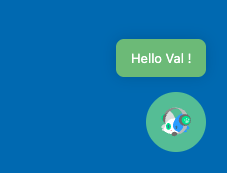
You can style it by using its class : .mwai-icon-text.
You can use the “UI Builder” to add or modify specific elements of the chatbot window. Some of these elements can use text from your settings; for instance, the Header will use the popup title in the Timeless theme. By default it is “AI Engine”, but you can set it to whatever value you want:
Shortcode
You can change all of these settings through the shortcode as well. Here are an examples. You can refer to the image of the settings above, as the parameter names in the shortcode are the same as those used in the settings, make sure to use snake case for each of them. For instance “Icon Text” will be “icon_text”.
[mwai_chat user_name="{DISPLAY_NAME}: " guest_name="Jon Meow: "]Positioning
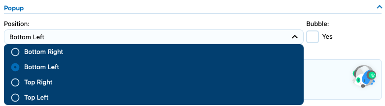
If you haven’t noticed already from the other screenshots, there’s a position setting available in the Popup section.
Settings
Shortcode
[mwai_chat icon_position="bottom-left"]Custom positioning
If you want to position the chatbot popup in a custom location, you can use custom CSS targeting the .mwai-window class or directly using the chatbot ID. Here’s how:
If you are not using the Default chatbot, make sure the ID is matching the chatbot you are trying to modify.
- First, locate the chatbot container by its ID — it will look something like #mwai-chatbot-default ( id=”mwai-chatbot-default” )
- Then, apply your desired position using CSS. For example:
#mwai-chatbot-default {
  top: 30px;
  bottom: inherit;
  right: 30px;
}
This will move the popup to 30px from the top and right.
Advanced Customization
This lists the CSS classes used in the AI Engine chatbot theme structure, organized hierarchically from the outermost container to the innermost elements.
Root Container
.mwai-chatbot (+ theme class)
The root container for the entire chatbot. Combined with a theme class like .mwai-foundation-theme, .mwai-chatgpt-theme, .mwai-timeless-theme, or .mwai-messages-theme.
Modifiers:
.mwai-window— Popup/floating chat window mode.mwai-fullscreen— Fullscreen mode.mwai-open— Window is currently open.mwai-opening— Window is animating open.mwai-closing— Window is animating closed.mwai-bubble— Bubble-style trigger icon.mwai-bottom-left,.mwai-bottom-right,.mwai-top-left,.mwai-top-right— Window position.mwai-center-open— Center the window when open.mwai-form-container— AI Forms mode
Window Mode Structure
.mwai-trigger
The clickable icon/button that opens the chat window (only visible when window is closed).
Children:
.mwai-icon-text-container— Container for the optional text bubble.mwai-icon-text— The text bubble message.mwai-icon-text-close— Close button for the text bubble
.mwai-icon-container— Container for the trigger icon.mwai-icon— The actual icon image.mwai-emoji— Emoji icon alternative
.mwai-window-box
Wrapper for window animation transitions. Contains the header and body.
Header
.mwai-header
The header bar of the chat window (visible in window mode).
Children:
.mwai-name— Chat title/name display.mwai-buttons— Container for window control buttons.mwai-resize-button— Fullscreen toggle button.mwai-close-button— Close window button
.mwai-mobile-header
Mobile-specific header shown when chat is fullscreen on mobile devices.
Children:
.mwai-mobile-header-title— The title text.mwai-mobile-header-close— Close button
Body
.mwai-body
Main body container holding all chat content. Uses flexbox column layout.
Children (in order):
.mwai-shortcuts— Quick action shortcuts (optional).mwai-conversation— The message thread.mwai-blocks— Dynamic content blocks (cards, widgets, etc.).mwai-files— File upload previews.mwai-input— The input area.mwai-footer— Footer with tools and compliance text
Shortcuts
.mwai-shortcuts
Container for quick action buttons.
Children:
.mwai-shortcut— Individual shortcut button.mwai-icon— Shortcut icon
Modifiers:
.mwai-success,.mwai-danger,.mwai-warning,.mwai-info— Color variants
Conversation / Messages
.mwai-conversation
Scrollable container for all chat messages. Supports custom scrollbar styling.
Modifiers:
.mwai-terminal— Terminal/CLI display mode
.mwai-reply
Individual message container (both user and AI messages).
Modifiers:
.mwai-user— User’s message.mwai-ai— AI’s response.mwai-system— System message.mwai-error— Error message.mwai-fade-out— Fade-out animation state
Children:
.mwai-name— Sender name/avatar area.mwai-name-text— The name text.mwai-avatar— Avatar image container.mwai-svg— SVG avatar modifier
.mwai-text— The message content.mwai-reply-actions— Action buttons (copy, download).mwai-copy-button— Copy to clipboard.mwai-download-button— Download content
Message Content
.mwai-text
The text content area within a message. Contains markdown-rendered content.
Notable children:
.mwai-image— Inline images.mwai-filename— File attachment display.mwai-typewriter— Typewriter animation wrapper.mwai-gallery— Image gallery gridpre,code— Code blocks with syntax highlighting (.hljs-*classes)- Standard HTML:
h1–h6,p,ul,ol,table,a
Terminal Mode
.mwai-terminal (on .mwai-conversation)
Transforms the conversation into a terminal/CLI interface.
Children:
.mwai-terminal-line— Individual terminal line.mwai-terminal-user— User input line.mwai-terminal-user-typing— Currently typing line.mwai-terminal-assistant— AI response line.mwai-terminal-system— System message line
.mwai-terminal-prompt— The command prompt icon (chevron).mwai-terminal-text— Line text content.mwai-terminal-input-wrapper— Wrapper for input text.mwai-terminal-typed— Currently typed text.mwai-terminal-cursor— Blinking cursor.mwai-terminal-cursor-active— Active/focused cursor.mwai-terminal-cursor-typing— Typing state.mwai-terminal-cursor-inactive— Inactive state
Dynamic Blocks
.mwai-blocks
Container for dynamically injected content blocks (rendered HTML).
Children:
.mwai-block— Individual block wrapper
File Uploads
.mwai-files
Container for file upload previews before sending.
Children:
.mwai-file-preview— Individual file preview.mwai-file-content— Content wrapper.mwai-file-thumbnail— Image thumbnail.mwai-file-icon— Document type icon.mwai-file-info— File details.mwai-file-name— Filename.mwai-file-size— File size
.mwai-file-progress— Upload progress bar.mwai-file-progress-bar— Progress indicator
.mwai-file-remove— Remove file button
Input Area
.mwai-input
Container for the text input and submit button.
Modifiers on .mwai-input-text:
.mwai-blocked— Input is blocked/disabled.mwai-dragging— File is being dragged over
Children:
.mwai-input-text— Text input wrappertextarea— The actual text input.mwai-microphone— Voice input button.mwai-file-upload-icon— File upload trigger.mwai-lucide— Lucide icon variant.mwai-upload-count— Upload count badge
.mwai-input-submit/button— Submit button
.mwai-file-upload
File upload functionality wrapper.
.mwai-file-upload-icon
The upload icon with sprite-based states:
.mwai-idle-add— Default add state.mwai-image-add,.mwai-image-up,.mwai-image-del,.mwai-image-ok— Image upload states.mwai-document-add,.mwai-document-up,.mwai-document-del,.mwai-document-ok— Document upload states
Footer
.mwai-footer
Footer area containing tools and compliance text.
Children:
.mwai-tools— Tool buttons container.mwai-file-upload— Upload button.mwai-file-upload-icon— Upload icon
.mwai-compliance— Legal/compliance text
Realtime Voice
.mwai-realtime
Container for real-time voice conversation UI.
Children:
.mwai-visualizer— Audio visualization.mwai-animation— Animated bars
.mwai-controls— Voice control buttons.mwai-push-to-talk— Push-to-talk button.mwai-active— Recording active state.mwai-talk-hint— Helper text
.mwai-last-transcript— Last transcribed text.mwai-statistics— Usage stats display.mwai-options— Additional options.mwai-option— Individual option toggle
Discussions (Chat History)
.mwai-discussions
Container for the discussions/history panel.
Children:
.mwai-header— Panel header.mwai-refresh-btn— Refresh list button
.mwai-body— Discussion list container.mwai-discussion— Individual discussion item.mwai-discussion-content— Content wrapper.mwai-discussion-title— Discussion title.mwai-discussion-info— Metadata.mwai-info-item— Individual info piece
.mwai-discussion-actions— Action buttons.mwai-menu-icon— Menu trigger
.mwai-active— Currently selected discussion
.mwai-pagination— Pagination controls.mwai-page-indicator— Page number display
.mwai-loading-overlay— Loading state.mwai-spinner— Loading spinner
Debug / Stream Events
.mwai-chunks
Debug display for streaming events.
Modifiers:
.mwai-chunks-collapsed— Collapsed state
Children:
.mwai-chunks-header— Header with controls.mwai-chunks-title— Section title.mwai-chunks-status— Status indicator.mwai-chunks-toggle— Expand/collapse button
.mwai-chunk— Individual event chunk.mwai-chunk-header— Chunk header.mwai-chunk-time— Timestamp.mwai-chunk-type— Event type badge.mwai-chunk-data— Data preview.mwai-chunk-expand— Expand icon
.mwai-chunk-details— Expanded detailspre— JSON/raw data
Context Menu
.mwai-context-menu-portal
Portal container for context menus (appears at document body level).
Children:
.mwai-context-menu— The menu container.mwai-menu-item— Individual menu item.mwai-danger— Destructive action style
Utility Classes
Transitions
.mwai-transition— Element with opacity transition.mwai-transition-visible— Visible state (opacity: 1)
Visibility
.mwai-hidden— Hidden element (used with reply actions)
Buttons
button.mwai-busy— Loading state with spinner
CSS Custom Properties (Variables)
These variables control the theme appearance:
| Variable | Description |
|---|---|
--mwai-spacing | Base spacing unit (padding/margins) |
--mwai-fontSize | Base font size |
--mwai-lineHeight | Line height for text |
--mwai-borderRadius | Corner radius |
--mwai-borderColor | Border color |
--mwai-width | Chatbot width |
--mwai-maxHeight | Maximum height (window mode) |
--mwai-iconSize | Trigger icon size |
--mwai-fontFamily | Font family |
--mwai-fontColor | Primary text color |
--mwai-headerColor | Header text color |
--mwai-primaryColor | Accent/primary color |
--mwai-accentColor | Secondary accent color |
--mwai-backgroundPrimaryColor | Main background |
--mwai-backgroundSecondaryColor | Secondary background |
--mwai-backgroundHeaderColor | Header background |
--mwai-backgroundAiColor | AI message background |
--mwai-bubbleColor | Bubble trigger color |
--mwai-iconTextColor | Icon text bubble text color |
--mwai-iconTextBackgroundColor | Icon text bubble background |
--mwai-conversationsBackgroundColor | Discussions panel background |
--mwai-conversationsTextColor | Discussions text color |
--mwai-errorBackgroundColor | Error message background |
--mwai-errorTextColor | Error message text color |
--mwai-lineColor | Divider line color |
--mwai-terminal-active-color | Terminal active element color |